Imagine you’ve designed an epic product – a toaster that fits slices of bread in it properly.
You’re onto a winner and toasters should be flying off the shelves but your website is letting you down – your customers aren’t converting and your bounce rate is high.
Even businesses with the most epic ideas need a homepage that’s optimized to convert to get the results they deserve.
The good news is you don’t need to be a digital marketing guru to create a winning homepage.
Read on for a step-by-step guide to creating a homepage that converts and generates you more cash.
Use the Inverted Pyramid Model to Prioritize Your Messaging
We’re not big ones for jargon here at Position Digital. But if there is some lingo you should take note of when it comes to optimising your homepage it’s the inverted pyramid model.
It’s got nothing to do with the pyramids in Egypt. But everything to do with the shape (just flipped upside down).

Anything at the broad end of the pyramid represents your most important information.
So, your deal-clinching, if-you-only-read-one-thing-about-our-brand-this-is-it copy.
This tapers off to the pointy end, which is where your lower priority messaging sits. Which usually covers finer details, like FAQs or nitty-gritty information that not everybody needs.
How to use the inverted pyramid model
- When hashing out your web design, think upside-down pyramid. The broad end represents your priority message and the narrow end represents your lower priority messages.
- Make sure the top of your homepage (above the fold) is optimised to convert people who know what they want and just want to take an action by including a conversion button, i.e. ‘buy now’ or ‘sign up.’
- Below the fold includes more detail so that people who need more information or more reassurance before taking action have their needs met too.
Allow Words and Design to Live in Harmony
A pet hate of ours and one that happens all the time in the world of website creation is when the person writing the website and the person designing the website don’t communicate.
This can lead to a website that feels clunky, clashing and cluttered.

Take the image above, for example. Imagine design is the lady touching her toes. Copy should be the lady in orange helping her reach her toes. The two elements should support and help each other towards the same goal (conversions!), rather than compete.
A web designer and copywriter who sit down and produce a website together or, even better, a person who can design and write a website, will see far better results.
On the flip side, a website where the elements don’t sit well together will cause a level of stress in your visitor. The exact opposite emotion we want people to feel when we want them to engage with us.
How to create harmonious web design
- Introduce your web designer and your copywriter and make it clear at the start of the project that you expect them to work in tandem to produce the web design. I would even go so far as to write this into the brief.
- When reviewing a proposed web design, consider if the copy and design feel harmonious. Is there enough space to explain the benefits of your product or service adequately, for example?
- Conduct usability testing to see how users react to the design. Try to capture how people are feeling and notice if they report any elements that appear incorrect or not as they would expect.
Lead With the Benefits
You might be excited about your product’s brand new feature but your customers aren’t. They only care about what’s in it for them: how your product or service will benefit them.
So, give them a reason to get excited. Give them a reason to stick around and nod their head as they scroll through your homepage. If your fake tan gives people a golden glow without the streaks or weird biscuit smell, then say it upfront. And say it loud. And if you can get it to them quicker than anybody else, shout it from the rooftops.
How to make sure you talk about benefits, not just features
- It’s okay to talk about features, as long as you demonstrate their benefit to your audience. Try to distil a feature down to how it will help your customer. For example, “our new formula fake tan is easier to apply and doesn’t streak.” The “new formula” is the feature and the bits in bold are the benefits.
- Conduct usability testing. Ask the user to tell you how your product or service will help them after looking at your homepage for 5 seconds. If they can’t see what’s in it for them within 5 seconds (absolute tops) then your landing page isn’t doing its job.
- To help get into a more benefit-focused mindset, ask yourself what problem your product or service is solving for people. There lie the benefits.
Good examples of benefits-driven landing pages
Below are two examples of great benefits-driven landing pages. You’d be able to head straight to either of these websites and know straight away what’s in it for you.

Above is a screenshot from HubSpot’s homepage. While they do list out the features of the product, they don’t do so without first explaining what the benefits are to the user, such as growing traffic, converting more visitors, getting deeper insights, automating tasks you hate, etc.

Here, Nike has included just a short amount of copy about it’s new running shoe, clearly focusing on the user benefits: helps reduce injury and makes running feel easy. They cut straight to the chase to explain why these running shoes will help you.
Design a Structure that Guides Your Customers to Take Action
UX or user experience can make or break your conversion rate.
If a customer has to scroll to the bottom of a page to find what they came to your site for, you can guarantee they won’t.
Now we’re in the age of good web design (thank god!), visitors won’t go rooting around to work out how to buy your products or engage with your service. They expect you to lead them by the hand. Your audience hasn’t got the time (or frankly, the inclination) to be a detective.
So, don’t force them to be one with bad web design.
3 tips to help your homepage flow well
- Help guide potential customers towards the information they are looking for by including action words and prompts. For example, a button that says ‘read more’ or ‘buy a ticket.’ Buttons with clear calls to action will prompt people to take that action.
- Use headlines to help customers skim read and navigate to what they’re looking for.
- Simple sentences, bullet points and creating clear sections on your homepage will help people navigate through a lot of new information easily.
Good examples of homepages that flow well

Squarespace has used an eye-design. But if you look at it, it follows the basic rules above. It uses action words and prompts, such as ‘create your website,’ ‘stand out online,’ and ‘get started.’
There is a big appealing white call to action button telling people to ‘get started’ with creating their website. Plus, the navigation bar at the top is clean and easy to understand.
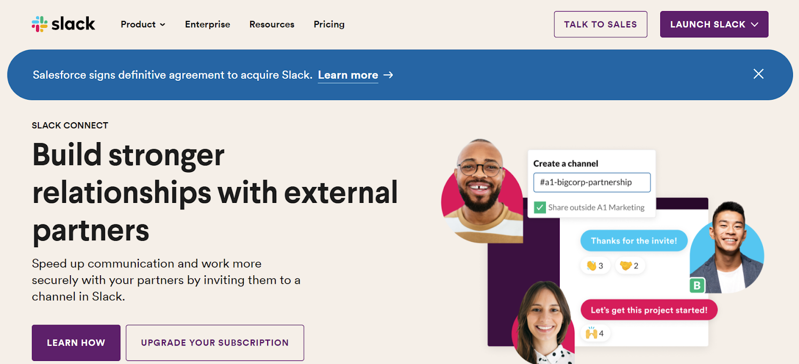
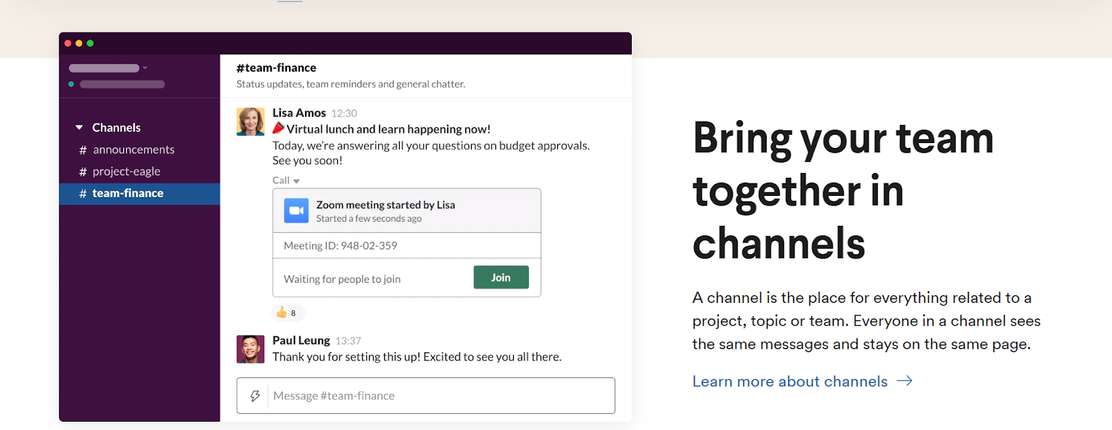
Above is Slack’s homepage, both above and below the fold. They’ve used a headline and subheadings to break up the information, plus action-based language, such as ‘learn how,’ ‘upgrade your subscription,’ and ‘learn more about channels.’
Their sentences are short and simply written helping readers understand the product quickly and easily.
Encourage People to Stay With Beautiful Web Design
While we don’t believe that beauty is skin deep, this is the age of Tinder and reality TV shows. So, we can’t deny our heads are turned by a pretty face as much as the next person.
And when it comes to beautiful web design, less is more. A cluttered, busy website that overdoes it screams desperation and a lack of confidence.
3 simple rules for appealing web design:
- Use a limited colour palette of 2 to 3 complementary colours. Dower Datech has done this well.
- Don’t be afraid of white space. It creates a sense of ease and order, the perfect headspace for decision-making customers. We’ve done this pretty well on our homepage.
- Invest in good quality images that capture the values and feel of your brand without having to say a word.

See above how AMAKA Studio has used an excellent image to capture what their brand is all about: publishing content that celebrates the diversity and dynamism of Pan-African womanhood.
Choose Your Words Carefully
Think of your homepage as your one chance to lay your stall out, build trust and get people to engage with your brand. No pressure!
Striking the right balance between helpfulness and persuasion is key here. And that’s easier said than done.
The best way to get in the right mindset for writing your homepage copy is to imagine a positive sales experience you’ve encountered.
Remember a time when a salesperson was just the right amount of helpful and led you to the till at just the right time so it felt effortless and not at all like you were being “sold to”. That’s exactly what you want your customers to feel when they go to your website.
4 simple copywriting rules to follow:
- Keep it short and sweet. People hate waffle. Short sentences that get straight to the point will always win out.
- Spend time on your headline. It’s the one thing people will always read. So, it should be where you spend most of your copywriting time. See our guide on writing SEO-friendly headlines.
- Write a clear, accurate call to action. Nobody likes clicking a button to then be taken somewhere they weren’t expecting.
- Use action-oriented words to give your website oomph. Think ‘get,’ ‘buy,’ ‘subscribe.’
Remember, words give us the ability to feel something. Don’t miss out on an opportunity to build a deeper connection with your audience by making poor word choices.
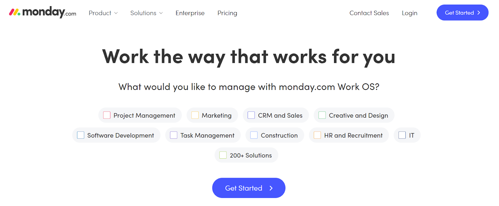
This Monday.com homepage is simple but effective. It doesn’t contain a paragraph of text, instead, it uses copy and design to drive people to take action.
Who doesn’t like ticking a box? The headline is effective at hooking in the reader as it clearly gets across the key benefit of the product.
Prove to Your Customers that You’re Not a Risky Bet
Don’t just talk the talk but walk the walk. Show your customers that you are who you say you are through third-party testimonials and reviews.
It can feel like a risk when we have to make decisions on the internet without meeting somebody in person. Will the quality be good? Have they oversold and will under-deliver on their service? Are they really as good as they make out they are? So, take that throw-of-the-dice feeling away by providing evidence from people that can vouch you are who you say you are: your happy customers.
How to reassure customers so they engage with you
- Testimonials are a great way to do this. If a customer has had a great experience with you, ask them if they would be willing to feature on your website with a quote about their experience with your business. People will think ‘If they were happy, chances are I would be too.’
- While reviews on the internet can always pose a risk, especially if a customer doesn’t have a good experience with your business, they’ve become a commonplace way to offer reassurance to customers. Reading a positive review of your business will help give wavering customers the friendly push they may need to convert.
- If you have something that makes you stand out from the crowd, like you’ve been in the business for 25 years or you’ve been endorsed by a national newspaper, this is great evidence of why you’re better placed for business than others in your market. So, make sure to include it on your homepage.

BorrowMyDoggy has included stories of happy customers with supporting images that help to bring to life the benefits of using their service, as well as reassuring prospective customers.
Make Your Calls to Action Clear and Bold
Your audience hasn’t been living under a rock. They know when they click on your website that you’re going to want them to take action.
They might even be ready and willing to take that action as soon as they arrive.
So, take the bull by the horns and tell them what action you want them to take.
How to make your calls to action more prominent
- Don’t hide your call to action in a paragraph of copy, use a big, bright button with a simple action on it, such as ‘get started, or, ‘get in touch.’
- You don’t want your customer to have to scroll back and forth on your homepage to be able to take an action, so make sure your calls to action appear often.
- Use a contrast colour for your call to action to make sure it stands out from the rest of your page.

Spotify has harnessed the power of the call to action button effectively. It’s clear from the moment you arrive at this page that you’re supposed to ‘get started’. And the lesser important call to action is to ‘view plans.’
Need Help Optimizing Your Homepage for Success?
At Position Digital, we’re a bunch of SEO enthusiasts that are always looking for creative ways to turn content into cash.
As strategic content marketers, we love working with businesses looking to grow by creating quality content that speaks to your audience.
So, if you like what you’ve read here, get in touch to chat about how we could work together.

